
Data analysis is becoming increasingly important for companies as it allows them to gain valuable insights and make informed business decisions. By finding patterns and trends in the data, companies can identify growth opportunities, improve operations, and stay competitive in the market. In today’s article, we will dive deeper into Sales Analytics and apply different kinds of analysis on a sales dataset, then we will try to get helpful insights out of it, which the company can use to its benefit.
Choosing a dataset
For this article, we will use a sales dataset for a car company. The dataset contains information about the products, prices, shipments, etc…. It contains data for sales that happened between 2003 and 2005. You can find the dataset here.
Importing the Libraries and the Dataset
| # Import necessary libraries import pandas as pd import matplotlib.pyplot as plt import seaborn as sns # Read in the data df=pd.read_csv(“sales_data_sample.csv”) |
Data Cleaning and Fixing
After storing the dataset in a data frame, we now start the cleaning process.
First, we can get the info of the dataframe:
| df.info() |
<class ‘pandas.core.frame.DataFrame’>
RangeIndex: 2823 entries, 0 to 2822
Data columns (total 17 columns):
# Column Non-Null Count Dtype
— —— ————– —–
0 Order Number 2823 non-null int64
1 Quantity 2823 non-null int64
2 Price Each 2823 non-null float64
3 Order Line Number 2823 non-null int64
4 Sales 2823 non-null float64
5 Order Date 2823 non-null object
6 Status 2823 non-null object
7 Quarter ID 2823 non-null int64
8 Month ID 2823 non-null int64
9 Year ID 2823 non-null int64
10 Product Line 2823 non-null object
11 MSRP 2823 non-null int64
12 Product Code 2823 non-null object
13 Customer Name 2823 non-null object
14 City 2823 non-null object
15 Country 2823 non-null object
16 Deal Size 2823 non-null object
dtypes: float64(2), int64(7), object(8)
memory usage: 375.1+ KB
We see that we have 2823 rows in the dataframe, and each column has 2823 non-null values as well, so we made sure we don’t have any null values in our dataframe. We check now if there are duplicated rows in the data frame.
| df.drop_duplicates(inplace=True) len(df) |
2823
We still have the same number of rows, so there were no duplicated rows.
And the final step of fixing data is to convert the ‘Order Date’ column to datetime type by using the to_datetime() method from pandas, allowing further analysis with this feature if needed.
| df[‘Order Date’] = pd.to_datetime(df[‘Order Date’]) |
Now we can say we have cleaned and fixed the data.
Cleaning and fixing data is an important step in the data analysis process, as it helps to ensure that the data is accurate and consistent. Cleaning the data can make the analysis process more accurate and reliable.
Data Visualization and Data Analysis
We start the second phase of the code. We will now visualize different features of the data frame, and we will get some statistics. This step varies from one developer to another, as there are an enormous amount of different ways to visualize the data we have. You can copy the code and play around with the features, and plot your figures to do your analysis.
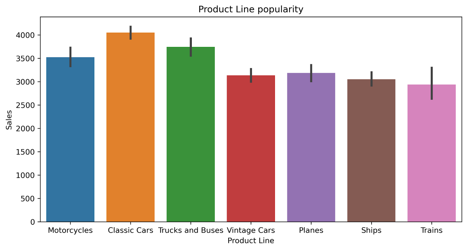
We will start by plotting the different product lines in the company, and check how they are performing in sales.
| # Understand the popularity of different Product Lines plt.figure(figsize=(10,5),dpi=300) sns.barplot(x=‘Product Line’, y=‘Sales’, data=df) plt.title(“Product Line popularity”) plt.xlabel(“Product Line”) plt.ylabel(“Sales”) plt.show() |
Now, checking the countries that the company has relations with, and the company’s performance in each one of these countries.
| # Understand the distribution of sales across different countries plt.figure(figsize=(20,10),dpi=600) sns.barplot(x=‘Country’, y=‘Sales’, data=df) plt.title(“Country-wise Sales distribution”) plt.xlabel(“Country”) plt.ylabel(“Sales”) plt.show() |

So far, nothing interesting. Using the above plottings, we can get simple information, such as The Product line with the best sales performance (Classic Cars), the Product line with the worst sales performance (Trains), and the countries the company works with, along with its performance in each of them.
Let’s get some statistics in the period of the dataset (between 2003 and 2005). The total revenue of the company:
| total_revenue = df[‘Sales’].sum() total_revenue |
10032628.85
The top 5 customers in average purchases:
| avg_sales_per_customer = df.groupby([‘Customer Name’]).mean()[‘Sales’] avg_sales_per_customer = avg_sales_per_customer.sort_values(ascending=False) print(avg_sales_per_customer.head()) |
Customer Name
Super Scale Inc. 4674.827647
Mini Caravy 4233.604211
La Corne D’abondance, Co. 4226.246957
Royale Belge 4180.012500
Muscle Machine Inc 4119.519583
Name: Sales, dtype: float64
The status of the orders:
| status_data = df.groupby([‘Status’]).sum() status_data=status_data[[‘Quantity’,‘Sales’]] print(status_data) |
Status Quantity $
————————————
Cancelled 2038 194487.48
Disputed 597 72212.86
In Process 1490 144729.96
On Hold 1879 178979.19
Resolved 1660 150718.28
Shipped 91403 9291501.08
The top 5 products in sales:
| popular_products = df.groupby([‘Product Code’]).sum().sort_values(by=‘Sales’, ascending=False) popular_products = popular_products[[“Quantity”,“Sales”]] print(popular_products.head()) |
Product Code Quantity $
————————————
S18_3232 1774 288245.42
S10_1949 961 191073.03
S10_4698 921 170401.07
S12_1108 973 168585.32
S18_2238 966 154623.95
And that’s it for this section. We have gained some useful insights from the plottings and the statistics we generated from our data frame. As we mentioned before, you can visualize different features, or get other statistics. It depends on your experience in data analysis, the company’s plans, etc…
More Complicated Analysis
Now, we will dive deeper into the analysis, and try to plot more complicated plottings.
| # group by year and month to calculate the total sales for each year-month sales_by_year_month = df.groupby([‘Year ID’, ‘Month ID’])[‘Sales’].sum() # create a line chart to visualize the total sales by year and month plt.figure(figsize=(10,5),dpi=300) sns.lineplot(data = sales_by_year_month.reset_index(), x = ‘Month ID’, y = ‘Sales’, hue = ‘Year ID’) plt.title(“Total Sales by Month and Year”) plt.xlabel(“Month”) plt.ylabel(“Sales”) plt.show() |

Here, we are checking the performance of sales throughout the years. We can tell that sales go up starting from the 9th month (September), and go down again in the 12th month (December). Two years aren’t enough to consider the rise in September as a “seasonality” in our dataset. However, the performance in 2003 and 2004 is almost identical during the period (September to December). That is a good sign that data has seasonality.
Now, We will display the top 15 cities in purchasing from the company:
| # group by city to calculate the total sales for each city city_sales = df.groupby([‘City’])[‘Sales’].sum().sort_values(ascending=False) # create a bar chart to visualize the total sales for each city plt.figure(figsize=(10,8),dpi=300) sns.barplot(x=city_sales.head(15).index, y=city_sales.head(15).values) plt.title(“Total Sales by City”) plt.xlabel(“City”) plt.ylabel(“Sales”) plt.xticks(rotation=90) plt.show() |

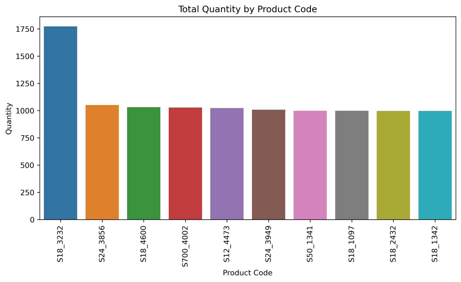
After that, we will display the top 10 sellers and the worst 10 sellers of the company’s products:
| # group by product code to calculate the total quantity for each code product_code_quantity = df.groupby([‘Product Code’])[‘Quantity’].sum().sort_values(ascending=False) # create a bar chart to visualize the total quantity for each product code plt.figure(figsize=(10,5),dpi=300) sns.barplot(x=product_code_quantity.head(10).index, y=product_code_quantity.head(10).values) plt.title(“Total Quantity by Product Code”) plt.xlabel(“Product Code”) plt.ylabel(“Quantity”) plt.xticks(rotation=90) plt.show() # create a bar chart to visualize the total quantity for each product code plt.figure(figsize=(10,5),dpi=300) sns.barplot(x=product_code_quantity.tail(10).index, y=product_code_quantity.tail(10).values) plt.title(“Total Quantity by Product Code”) plt.xlabel(“Product Code”) plt.ylabel(“Quantity”) plt.xticks(rotation=90) plt.show() |

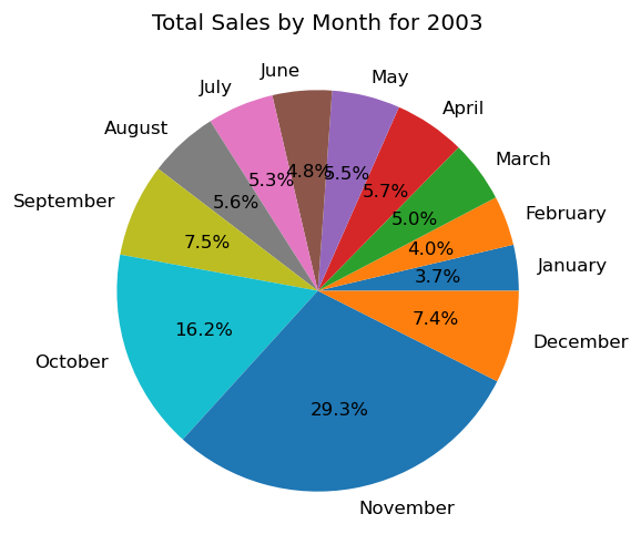
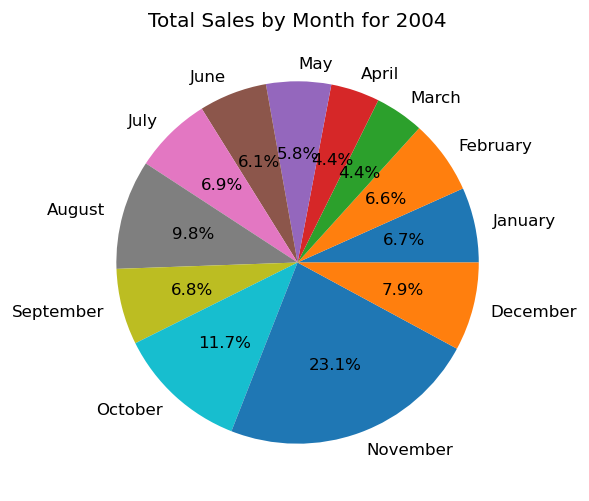
Finally, We will display some pie charts, to understand the distribution of sales in different quarters and months of the year:
| # group by year and quarter to calculate the total sales for each year-quarter sales_by_year_quarter = df.groupby([‘Year ID’, ‘Quarter ID’])[‘Sales’].sum() # get the unique years in the dataset years = df[‘Year ID’].unique() # loop through the unique years and create a pie chart for each year for year in years: # filter the data to only include the selected year filtered_data = sales_by_year_quarter[sales_by_year_quarter.index.get_level_values(‘Year ID’) == year] # create a pie chart to visualize the total sales for each quarter of the selected year plt.figure(figsize=(5,5),dpi=120) try: plt.pie(filtered_data, labels=[‘Q1’, ‘Q2’, ‘Q3’, ‘Q4’], autopct=‘%1.1f%%’) plt.title(“Total Sales by Quarter for “ + str(year)) plt.show() except: plt.clf() |


| # group by year and month to calculate the total sales for each year-month sales_by_year_month = df.groupby([‘Year ID’, ‘Month ID’])[‘Sales’].sum() # get the unique years in the dataset years = df[‘Year ID’].unique() # loop through the unique years and create a pie chart for each year for year in years: # filter the data to only include the selected year filtered_data = sales_by_year_month[sales_by_year_month.index.get_level_values(‘Year ID’) == year] # create a pie chart to visualize the total sales for each month of the selected year try: plt.figure(figsize=(5,5),dpi=120) plt.pie(filtered_data, labels=[‘January’, ‘February’, ‘March’, ‘April’, ‘May’, ‘June’, ‘July’, ‘August’, ‘September’, ‘October’, ‘November’, ‘December’], autopct=‘%1.1f%%’) plt.title(“Total Sales by Month for “ + str(year)) plt.show() except: plt.clf() |
And we will end our analysis here, we have gained good information and insights. Companies can use our data for future planning, expansions, understanding the nature of customers in different cities and countries, and much more.
Conclusion
We have completed our analysis of the dataset, coming up with useful insights and statistics, which can be used by the company for improving and planning. The results of our analysis show that the company can consider expanding more in Spain, where it already has a good market. They can consider increasing the readiness of its warehouses and storage units before September, to handle the rise in sales that happens then. More insights can be found, but this is enough for our analysis. You can download the data, and try to play around and find new insights yourself!